About Me

My photo
Delta, British Columbia, Canada
I took very early retirement from teaching in '06 and did some traveling in Europe and the UK before settling down to do some private tutoring. As a voracious reader, I have many books waiting in line for me to read. Tell me I shouldn't read something, and I will. I'm a happy, optimistic person and I love to travel and through that believe that life can be a continuous learning experience. I'm looking forward to traveling more some day. I enjoy walking, cycling, water aerobics & and sports like tennis, volleyball, and fastpitch/baseball. I'm just getting into photography as a hobby and I'm enjoying learning all the bits and bobs of my digital camera. My family is everything to me and I'm delighted to be the mother of two girls and the Gramma of a boy and a girl. I may be a Gramma, but I'm at heart just a girl who wants to have fun.

Friday, February 24, 2012

G is for GRAYSCALE

Grayscale is a photo that is made up of varying tones of black and white. Grayscale is basically black and white photos. These images are also monochromatic, which means there is only one (mono) colour (chrome) in the image. Most people have some sort of computer imaging software and will tweak their photos by fixing the contrast, colour levels, hue, tint, saturation, and will also tweak the dark and light shadows. In contrast, you can also put colour into original old black and white photos with these software products. Click to enlarge all photos.

Some of you may have previously seen the following photo on my blog. However, see what you think of the photo when I transform it into grayscale. What are your thoughts?


I think that the simple act of turning the photo into black and white, or grayscale, makes the photo look more like it was taken in the 40s or 50s instead of in 2006. Also, you notice the shadows and the men instead of being distracted by the colours they're wearing.

Here are a few more photos that I converted into grayscale:

What did you notice about my choice of photos to convert to grayscale? If you thought "all the photos are of historic places or things," you would be correct. The old shipbuilding warehouse in the village of Steveston, the railway station and tracks in Fort Langley, the old 1940s luggage, the World War 2 cannon in England, and the historic church all look even better in grayscale. Not everything works in grayscale, although you might have noticed that lots of young couples are getting engagement or wedding photos done in grayscale.

Here's one more photo to consider. The first has the shadows lightened to the maximum, the second has the shadows darkened to the maximum, and the final photo is my preference with a midtone contrast. It's all in how you prefer your photos.
This week, I encourage you all the experiment with your photo software! Try converting some of your photos to grayscale and see what you think about it.

Thanks as usual go to Mrs. Nesbitt for her gargantuan effort to keep ABC Wednesday alive and growing! Her gallant gang of gorgeous and good-natured teammates will visit all participants and let them know how much we appreciate their contributions. Some of us are goofy, some are gushy, some are grouchy but we are all gleefully generous in our glowing praises! You will all receive a gloriously great grade just for joining in!

Saturday, February 18, 2012

F is for F-STOP and FILES

First of all, I want to thank everyone for stopping by last week to comment on my post, especially those who really liked the photo of the reflected boat sheds (a lot of blue). I had entered that photo on Red Bubble, and it was featured in the Beautiful BC Group on Friday. So thanks again!

One of the most difficult things for me to understand so far in my study of photography is the F-Stop. I think it's because I don't have an SLR camera, but rather a high-level digital. I only get to practise changing the aperture settings to a certain extent, so it's still a bit of a mysterious part of photography. I will try to explain it so you and I both will get it, though. This is all thanks to many websites I've checked out so here goes.

First, we have to understand what "aperture" means. It is the opening formed by a system of metal leaves in the lens that open up and close down to control the volume of light passing through the lens. It is the lens's equivalent of the iris of our eye. (from here) Keeping this in mind, the F-Stop is the number given to indicate how much light is allowed through the lens. Simply put, the higher the number equals less light allowed in and the lower the number equals more light allowed in. A photo taken at F-2 will be brighter than a photo taken at F-16. Here are a couple of examples of photos I took of a rose at different F-stops. The one on the left was set at -2.0 and the one on the right was set at +2.0. Neither is right for the photo, but from practise, I found the proper setting.


Something that my photography tutor suggested is that when you upload your photos, always save the original in a special File. Then when you crop, resize, adjust contrast and levels, etc. save it again in a different File. That way, if you want to try different things like colour, saturation, cropping and sizing at another time, you'll always have the original to work from. I have to admit that I don't always do this except for photos that I consider to be first rate. My cameras seem to take photos in 72 or 96 dpi, too, so I always change it to 300 dpi. Here is an example of an original photo that I cropped and increased to 300 dpi. It was taken in Italy in 2006.


Special thanks go to the Fabulous Denise Nesbitt for creating ABC Wednesdays. She and her formidable team of faithful, fashionable and far-flung cyber family help her out by visiting all the contributors to make comments and let them know how much we appreciate their posts. Please join in as it's so much FUN!

Sunday, February 12, 2012

E is for EXPOSURE and EXTREMES

Exposure in photography means the amount of light falling on the image during the process of taking a photograph. This can be very complicated when trying to educate oneself, as I am, especially when I don't have an SLR camera, but rather a high-level digital. Simply put, it refers to the length of time the shutter is open. Low light requires a longer shutter cycle while strong light requires a shorter shutter cycle. With SLR cameras, the photographer adjusts the exposure manually, whereas with the type of camera I have, the exposure is calculated automatically. To read more detailed information about exposure, click here or here for a video explanation.

Don't forget to click on the photos to see them in a larger format.

The following are examples of (1) low light exposure (photo courtesy of L Evans copyright) and (2) bright light exposure (my photo).


An extreme in photography is anything that surpasses the standard or is rare. For example, not rather high, but extremely high. Not a little cold, but excessively cold. Not some emotion but exhilarating emotion. Not some details, but excessive and sharp details. Extremes bring drama or visual impact and are related to what are called oddities. These oddities will become weird or bizarre when taken to the extreme. Also, an extreme does not need to be an oddity. For example, a fire is hot as we all know, but its excessively high temperature can be called an extreme.

This photo is considered to be extreme because of the contrast between the dark foreground shape and the brilliant fire-like sunset. The following one is extreme because of its contrast - it is not really black and white but appears to be. (Photos courtesy of L Evans copyright)

The following two photos of my own are "extreme" because the first one is not a little blue, but extra-brilliant blue. And the next one is extremely high.

Extremely excessive thanks to our extraordinary hostess Denise Nesbitt for designing this exciting ABC Wednesday. Her enthusiastic ensemble of assistants will drop by all the participants' contributions to give expansive comments on your posts. Please join in the fun if you haven't yet by simply clicking here.

Sunday, February 05, 2012

D is for DIGITAL, DEPTH OF FIELD, and DPI

A digital camera is one that captures the photo not on film, but in an electronic imaging sensor that takes the place of film. I purchased my first digital camera in the spring of 2006 and was absolutely thrilled with it. Taking it with me to Italy for a month that fall, I captured lots of great shots, one of which actually came in 3rd place in a recent challenge on Red Bubble.

My next digital camera was an income tax return gift to myself about a year ago. Funnily enough, even though it's a better camera, it was about $200 cheaper than the first one! With this new one, I can do so much more and have learned ooDles more about taking proper photographs. To be honest and direct, I don't understand how to set the depth of field on my own camera very well because it's not a manual camera. I have to determine it by trying different shots of the same thing and then checking to see how the photos turn out.

Depth of field refers to the range of distance that appears acceptably sharp. It varies depending on camera type, aperture and focusing distance, although print size and viewing distance can also influence our perception of depth of field. (from http://www.cambridgeincolour.com/tutorials/depth-of-field.htm) For example, the higher the f-stop number, the clearer the image. Below, the photo on the left was set at f/8.0 while the one at the right was at f/2.8.


Here are a few of my own shots that show what is in focus and what is not in focus.
Notice that I wanted to show the two-toned maple leaf and focused on it, causing the background to blur out. And in the next shot, I wanted the heron to stand out, but I mistakenly made the grassy reeds clear and blurred the heron.

Ah well, we learn by making mistakes in all things photographic. The last detail about digital cameras I wanted to define for you is DPI, which means "dots per inch." This measures the resolution of the image - the higher the number the greater the resolution. I have found that my camera seems to have an "automatic" setting and when I upload my photos, I change the resolution to 300 dpi. Take a look at the following photos of a yellow dahlia. On the left, the resolution is at 96dpi and the one on the right is changed to 300dpi. Click on the photos to view them larger. I hope you see how the one on the right is a sharper image.


D
eepest regards to Denise Nesbitt, our dynamic leader who continues to lead the charge every week for ABC Wednesday! She and her daffy but dapper, dashing and dependable group of assistants diligently diverge from their daily lives to visit all the participants and leave a short, delightful note of admiration. Please join us by clicking here! It's quick and easy and we'd love for you to be part of the group.

Sunday, January 29, 2012

C is for COMPOSITION

Welcome back to ABC Wednesday, created and hosted by the inComparable Mrs. Nesbitt and assisted by her courageous coven of crazy and cackling characters, including moi from Canada! First off, I would thank to thank so many of my readers who commented on my previous post (Background) and praised my photo of the pumpkin patch. I didn't mention it, but it did win a challenge on Red Bubble for the month of October, and I celebrated it as my first win for any of my photos!

This week, I'd like to discuss "composition." There are three main rules around composition: the rule of thirds, the golden section rule, and the diagonal rule. I checked out various websites and chose one that seemed to be concise and simple to understand. You can see it here. You can click on any photo to enlarge it.

The rule of thirds is based on the fact that the human eye is naturally drawn to a point about two-thirds up a page. Imagine your photo divided into nine equal sections. When lining up your shot, make sure your main subjects are lined up at the intersection points, rather than centered. See photo below from the website.

Here are a few of my own photos that I think show good composition by using the rule of thirds.

The next rule is called the Golden Section Rule. This means that certain points in a picture's composition automatically attract the viewer's attention. Imagine your photo being divided into nine unequal sections. Each line is drawn so that the width of the resulting small part of the image relates to that of the big part exactly as the width of the whole image relates to the width of the big part. Points where the lines intersect are the "golden" points of the picture. See photo below from the website.

And one of my own photos:
The final rule for composition is the diagonal rule. This means that one side of the picture is divided into two, and then each half is divided into three parts. The adjacent side is divided so that the lines connecting the resulting points form a diagonal frame. According to the Diagonal Rule, important elements of the picture should be placed along these diagonals. See photo below from the website:

And a couple of my own photos, far from perfect as I've been working on trying to keep my camera straight and not on a diagonal:

There you have it - my contribution to Round 10, Week 3. I hope I haven't bored you completely to death and that you'll leave a comment to let me know if you're still compos mentis after reading all this. Ciao until next week.

Thursday, January 19, 2012

B is for BACKGROUND

As I look back on the photos I've taken over the past few years, I notice that I'm getting better and better shots. Why is this? Before really getting into photography as a hobby, I simply looked at something and took the shot. I did not consider the background at all. Even now, I sometimes get so excited about something that I forget that taking the background into consideration can make the difference between a photo and work of art. So what do we look for when we factor in the background?

The first thing to do is scan the background of your shot and check for colours and lines that might clash with your subject. Next, if your camera has the capability, throw the background out of focus by using depth of field. This is best done with a manual digital single lens reflex camera. Mine is not a manual, but I do have the capability of choosing some aperture settings. Also, you could either move the subject or move yourself to get a better angle (see previous post). One of the most effective ways to deal with background is to fill the frame with your subject. I love using my macro and super macro settings and will discuss this when it's M week. In addition, you could go out to take photos with your own background. For example, take coloured sheets of card stock with you or a variety of coloured fabrics to act as background. Finally, there are lots of different photo editing software available. I use Photoshop Elements and really enjoy fooling around with its capabilities. Not that I do all these things every time, but I can sharpen the focus, adjust the contrast, lighten or darken shadows, and play with colours by changing the hue, temperature, and saturation of a photo. Also, I can crop and resize the image.

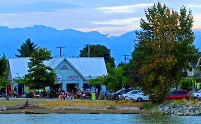
In the following photo, I took a shot from the boat as we were cruising past Steveston Village. I recognized the location as one where L and I frequently go and sit in our sun chairs to relax, read and watch the boats go by. Pajos Restaurant is there, too, where we'll buy fish and chips to nibble during those long, lazy summer afternoons. Looking at it now, I see so much more than what I wanted to shoot. There is not only the tree, beside which we sit just above the rocks, and the restaurant, but also in the shot there are cars, a condo, telephone poles, the mountains, and an airplane taking off. I never noticed these things at the time.

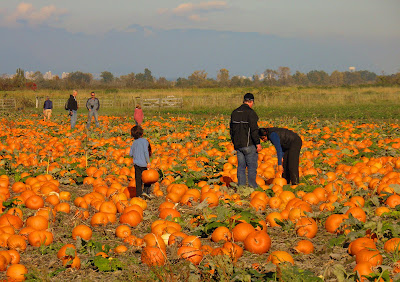
In this next shot, I had quickly pulled over to the side of the road because the field was so bright and beautiful. However, I was worried about all the cars passing and took a quick shot, not taking into account anything except the little girl dragging her pumpkin away. You will notice (and I think this is a bit amusing) two men standing around chatting with cameras around their necks, one lady walking away, and another little girl lagging behind her. Also, if you look beyond the field, you will see a bit of the city past the treeline and mountains in the far distance. I actually like this because you are able to see just how close my neighbourhood is to Vancouver. We live in a semi-rural area, but with city conveniences near at hand.

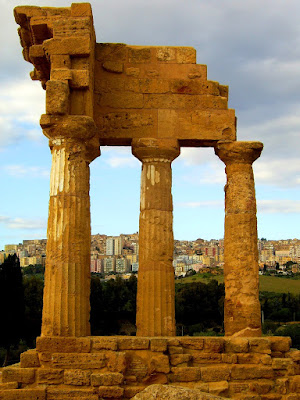
I took this shot over 5 years ago when I was travelling in Sicily. We were at the Valley of the Temples where you'll find the remains of eight Greek temples. I took several shots of this particular one (the Temple of Castor and Pollux) and finally got up as close as I could to block out the background of the city of Agrigento behind. However, I do like this shot as it shows the incongruity of the ancient ruins and the modern city so near to each other.

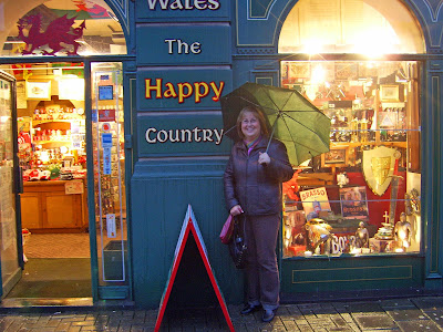
And one more shot, this time of me standing in front of a sign in Cardiff that reads, "Wales The Happy Country." It was pouring rain and my friend said to go stand by the sign and he'd take my photo. Now when I look at it, I see the dragon (symbol of Wales) plus the shop windows that we didn't stop to look at while there. Next time I'm in Cardiff, I will try to find that shop again and go in to look around. In this case, I'm glad the background is there, even if it hadn't originally meant to be.

Thanks to Denise Nesbitt, our bold buccaneer, for creating ABC Wednesdays and for keeping it going for nigh on 5 years! It has become international and more and more people are contributing each week. Mrs. Nesbitt's bright and beautiful assistants take turns producing each week's beginning post and will take a break in their day to visit all the other posts. So do consider bonding with us by clicking here to see each week's contributors.

Monday, January 16, 2012

A is for ANGLES

All aboard for Round 10 of ABC Wednesday? Awesome! For this round, I've decided to focus on learning more about photography. I took an informal class for 12 weeks in the fall and learned quite a bit but, naturally, there's so much more to learn. The next class doesn't begin until March, so in the meantime, this will help me to keep everything front and center, continue learning and practising, and share some of my photos.

At first, I was going to do "aperture," but since I'm not using a manual SLR, but rather a digital with some manual settings, I'm going to use the word "angles" instead. Try experimenting with photos by getting right down on the floor or the ground, sit on a chair and look up...waaaay up, or climb on something and look down. Tilt your camera one way and then the other. Try out different angles and try to get shots with angles in them. I know, I know, people will see you and think "what on earth is that person doing???" but who cares? With a camera in hand, pretend you're a professional with a contract for some high-class magazine and just go for it. When you look at your shots on Photoshop or other software, you'll see that most of the shots are awful. However, sometimes you'll get it just right and give yourself an A+ for effort! And you'll even learn from the awful shots!

Here are just a few shots where I was attempting to shoot angles.

Go ahead and attempt your own shots with angles. And while you're at it, remember Mrs. Nesbitt who gave us the very first ABC Wednesday and has kept it going for almost 5 years! She sure gets an A+ for all her endeavours, along with her able-bodied A-list of aides! To check out ABCW, just click here and join in the fun.

Sunday, January 08, 2012

Z is for ZEAL

It's hard to believe that we're already at the end of Round 9 in ABC Wednesday! Actually, it's quite timely, since we've just started a new year - 2012 - and hopefully, like me, you all have a new zest for life. Although the weather may be cold, wet or white, let's all find something to get excited about - make snow angels, buy some new wellies and a new brollie and sing in the rain, or experiment with taking photos during a dark, grey day. It won't be long and we'll see snow drops, hyacinths, narcissi, daffodils, and tulips! So don't sleep away these dark days of winter, but rather get out and about with a zealous attitude!

ZEAL

Zeal is like promiscuous purple pansies.

It looks like playful, chattering chimpanzees.

It sounds like giggles that turn into hoots.

It smells like French fries and tropical fruits.

It tastes like Snickers and sugar and spice.

It feels like daring delight rolling the dice.

Zeal is enthusiasm for everything in life.

Continued thanks to our zippy leader, Denise Nesbitt, who created ABCW and with her zealous group of assistants, continues to keep us on our toes. Please join in the fun any time you wish, but this would be the perfect time now that we're starting Round 10. Just click here to check us out.